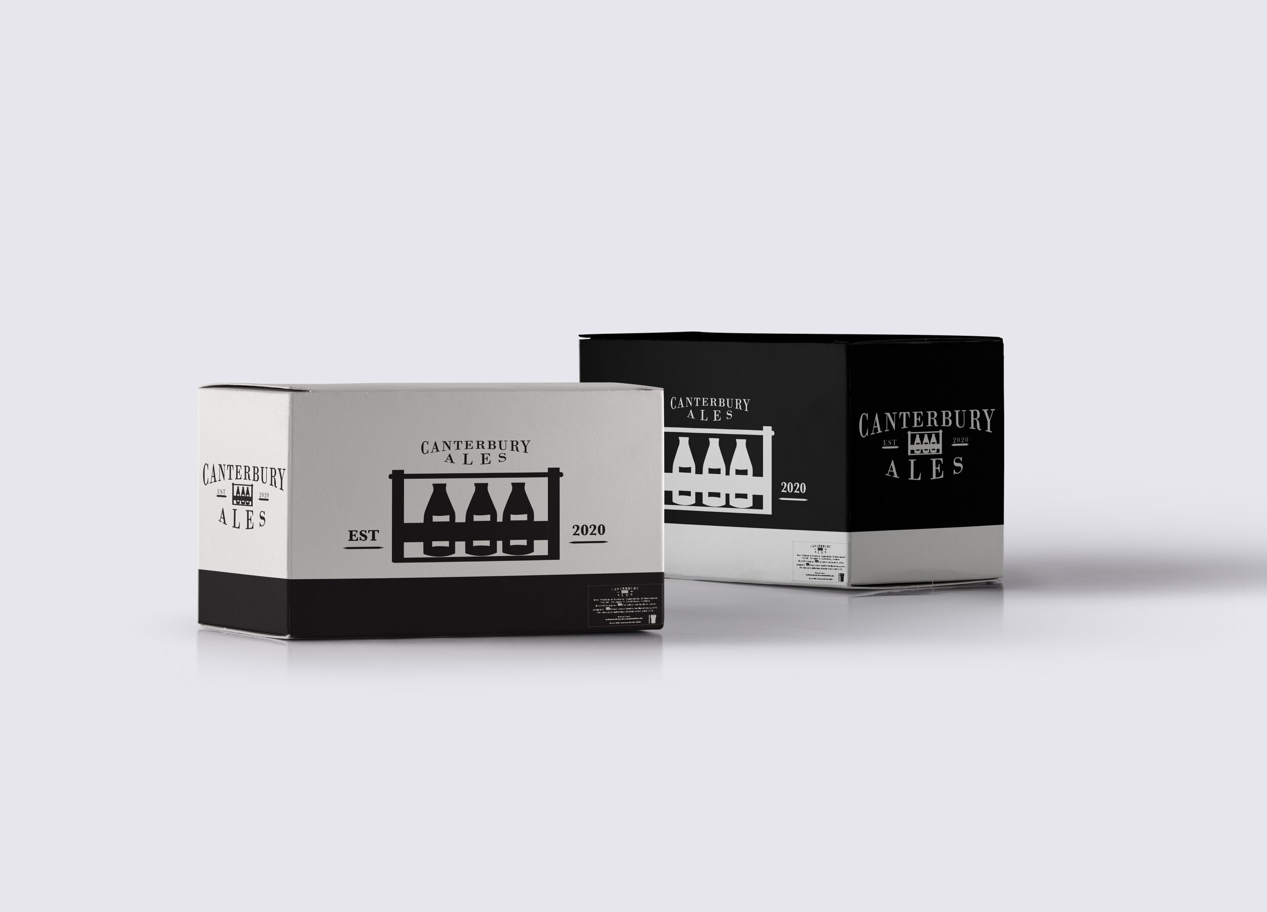
This engagement was a community-based project that I volunteered for. Canterbury Ales specializes in delivering high-quality homemade brews directly to your door, presented in wooden crates.
While I admired Canterbury Ales' commitment to community initiatives, I noticed room for improvement in their design, particularly the prevalent use of Comic Sans MS at the time. Recognizing the potential for enhancing the visual appeal of this outstanding local business, I proposed a redesign.
Initiating contact by delivering a letter to the brewery, I soon found myself entrusted with the task of creating a new brand identity for Canterbury Ales.
Considering the homemade nature of their beers, we adhered to specific requirements. These included an old-timey logo, labels that could be easily washed off for bottle repurposing, black and white labels, and a design that conservatively utilized ink. The resulting design features a simple yet classic old-timey logo, incorporating iconography inspired by the wooden crates integral to the humble past of this local business, symbolizing the delivery of their homemade brews.